Back

Blasted through obstacles to growth

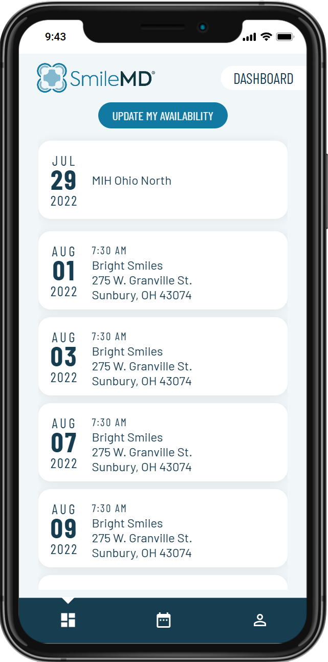
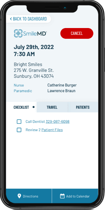
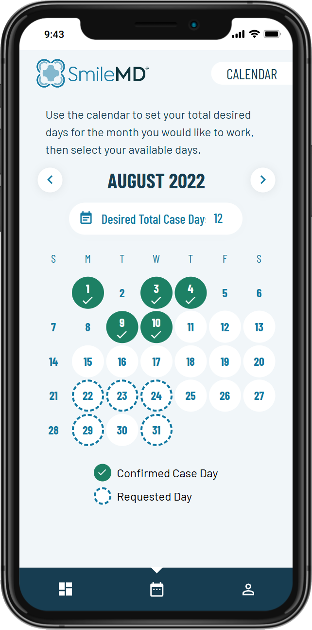
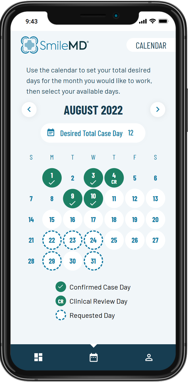
A start-up that provided in-dental office anesthesia services was struggling to scale due to a manual scheduling process with their providers and dental offices (practices).

~55%
comms reduction
~85%
staff time reduction
~90%
provider no-show reduction
2+
digital products
This looks like a job for...

Initially our hero stood alone against this formidable challenge, drafting a product strategy and UX design of the platform while working with the leadership and the development team to get an MVP into market. As the platform grew, the hero brought in a sidekick and mentored another hero, the product owner, to outpace constraints. With the terrain under their watchful eyes, the hero could turn his focus to envisioning expanded service offerings and putting a design system in place to allow for future rapid scale.

Research
Using his secret identity as a mild mannered UX designer, our hero shadowed the internal scheduling and operations team, sketching out a Jobs-To-Be-Done model. Using those findings the hero spoke to a few providers and practices that were already working with the company. Recognizing that the providers and practices time was precious, research for them was laser focused on Usefulness and Utility. Usability testing would be conducted unmoderated with users similar to our users.

The initail series of questions were designed to understand the mental model of scheduling with our users. In a subsequent session, the focus was on walkeing through the high-functional fidelity prototype as a concrete example of the prior discussion.
Strategy
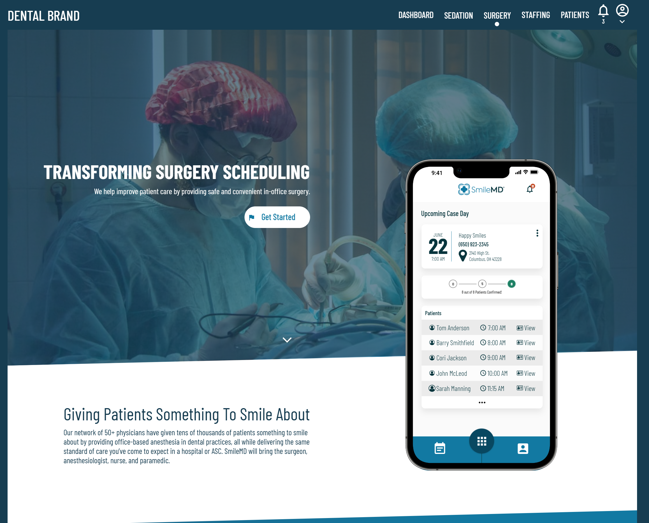
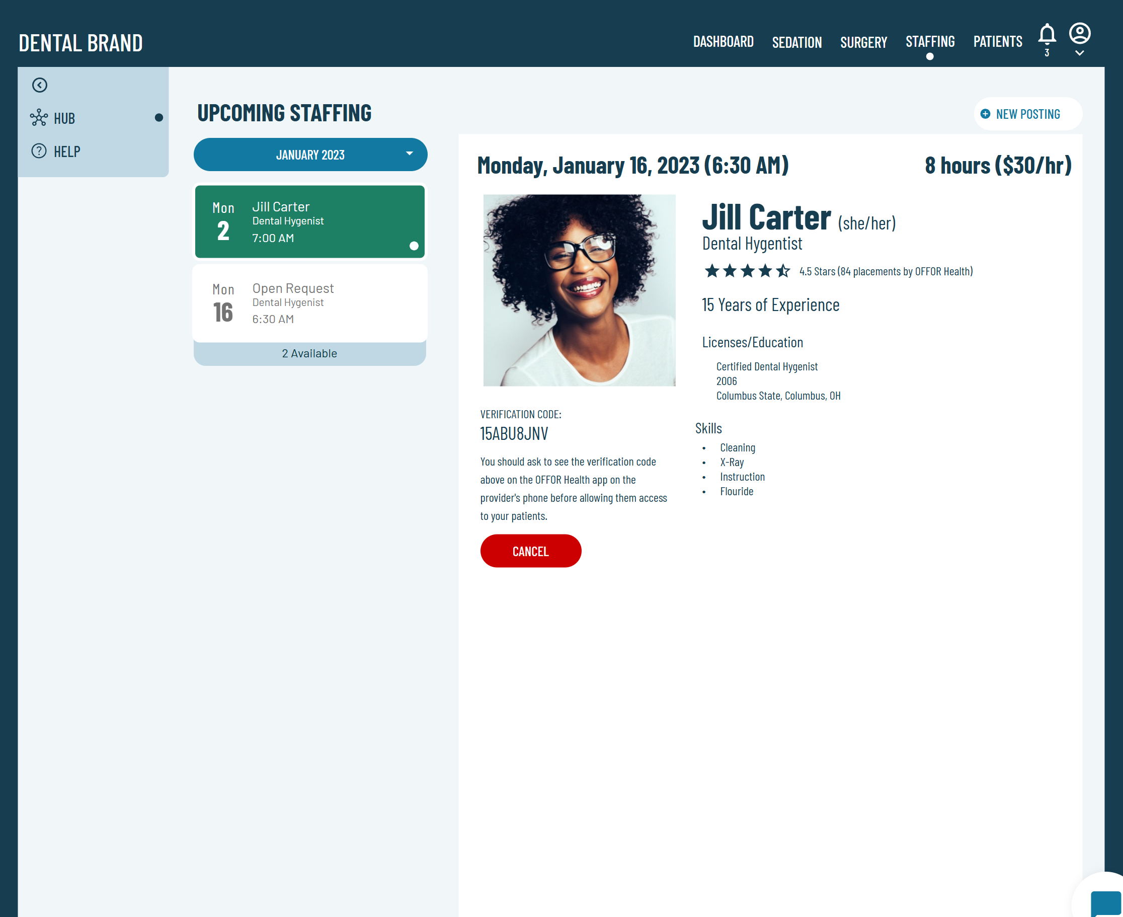
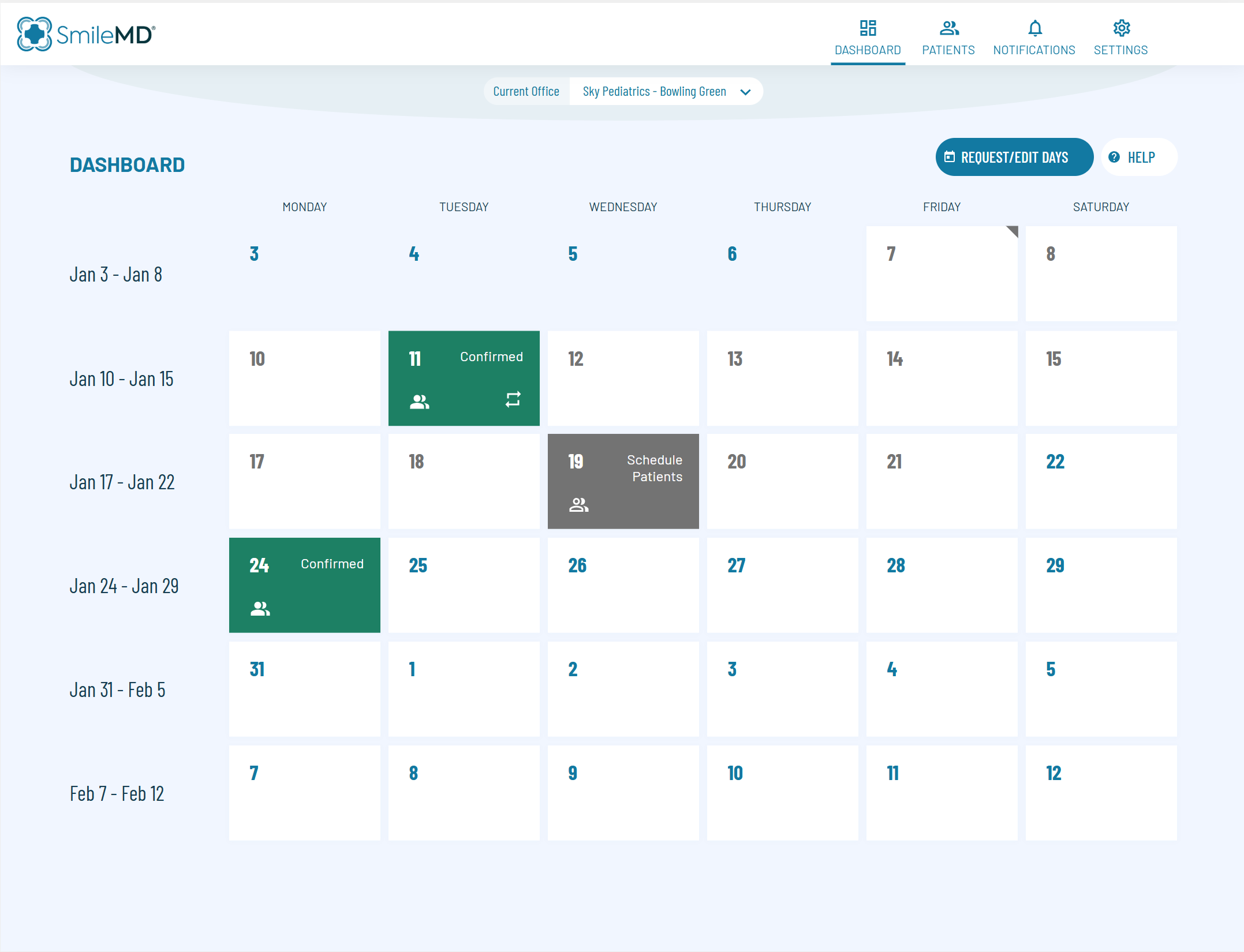
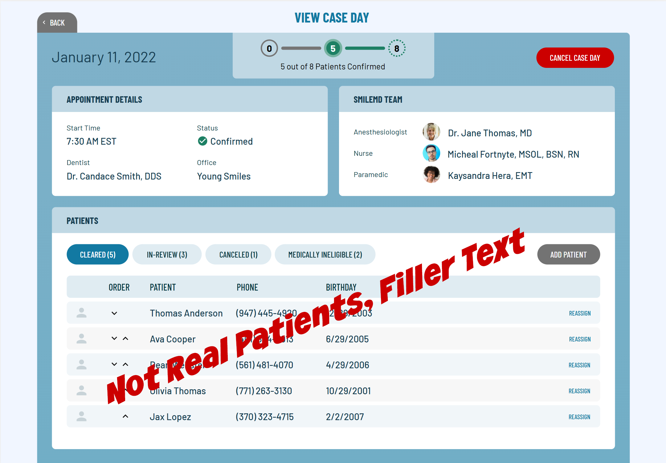
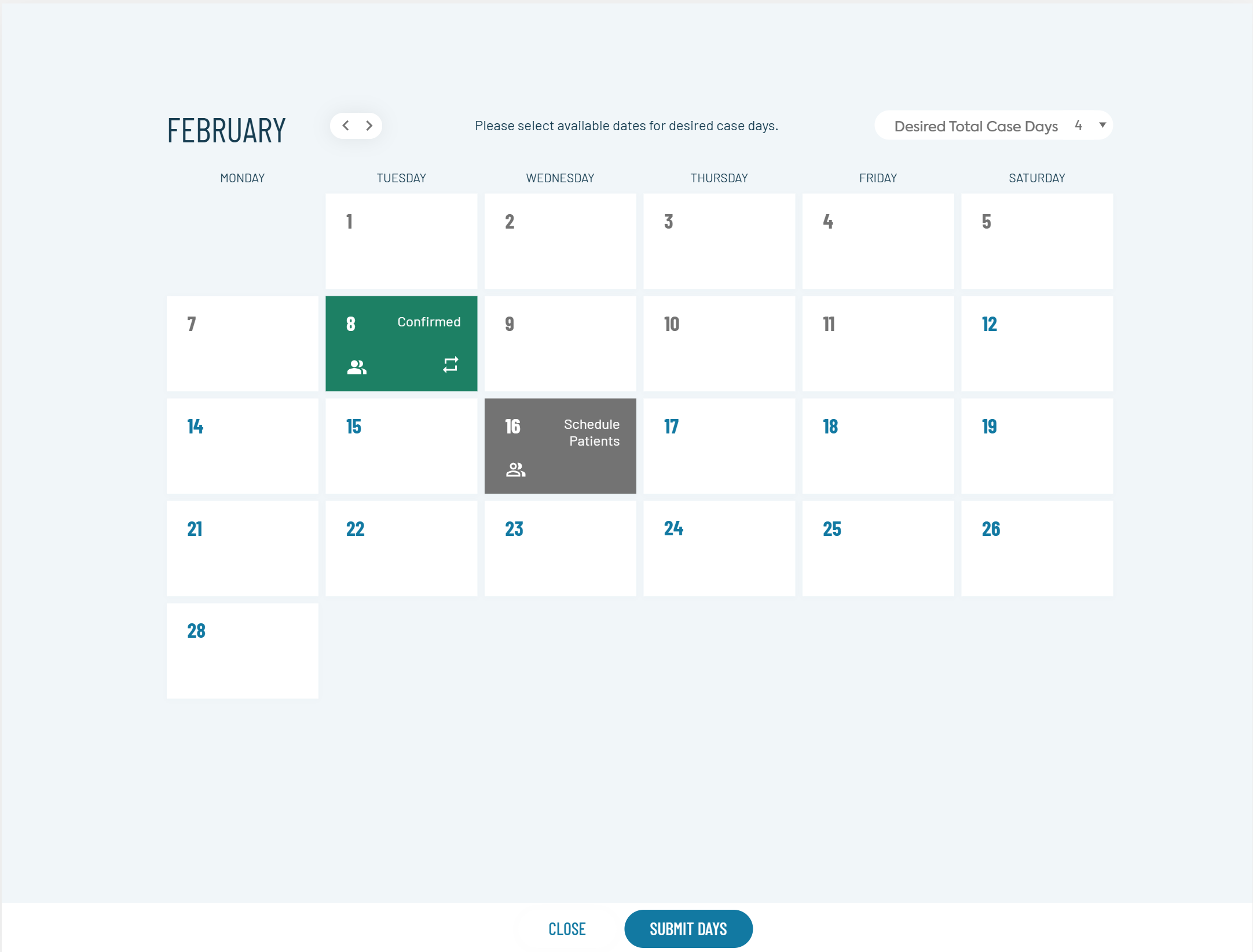
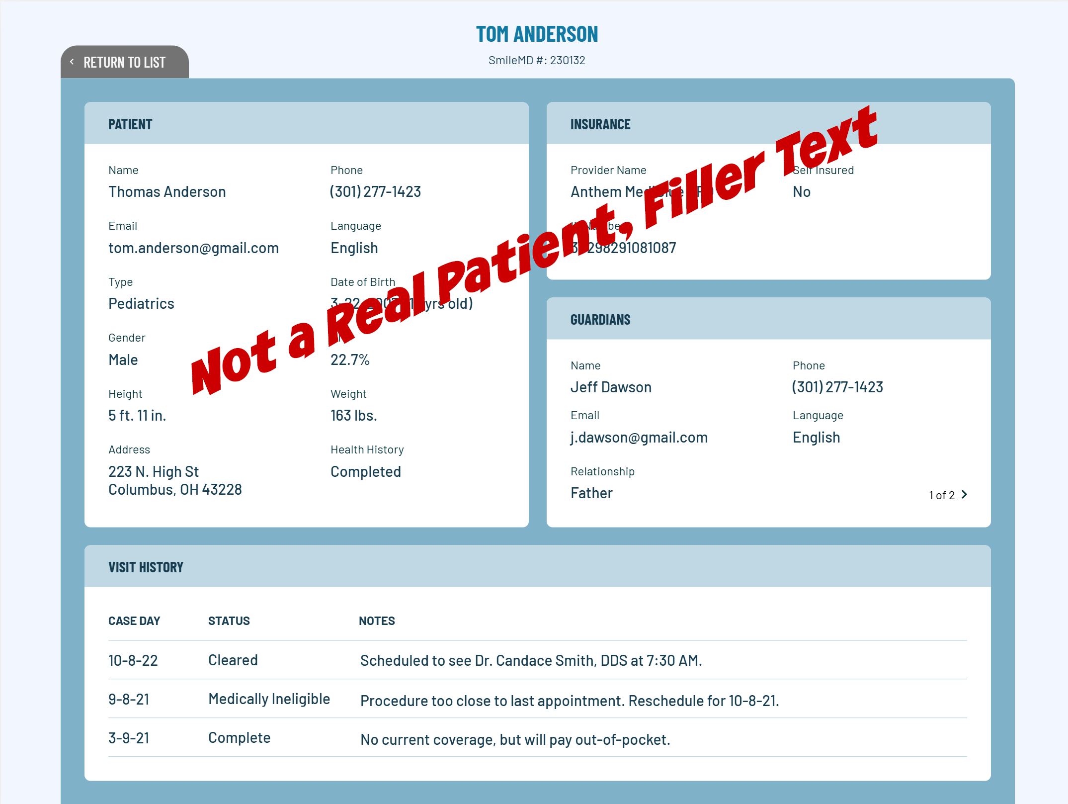
The primary focus of the platform was to enable the dental anesthesia service delivery through tech, which drove the initial roadmap. The end-to-end journey of providers, practices and patients were mapped to KPI's and experience improvement efforts. Also the company had a multiplier in mind to offer additional services within the dental brand, expanding the existing care model into other verticals and scaling the tech platform into other care models. Our hero ensured that decisions that could impact this future scalability were made intentionally and occasionally illustrate the vision more concretely as the samples below indicate.
Design
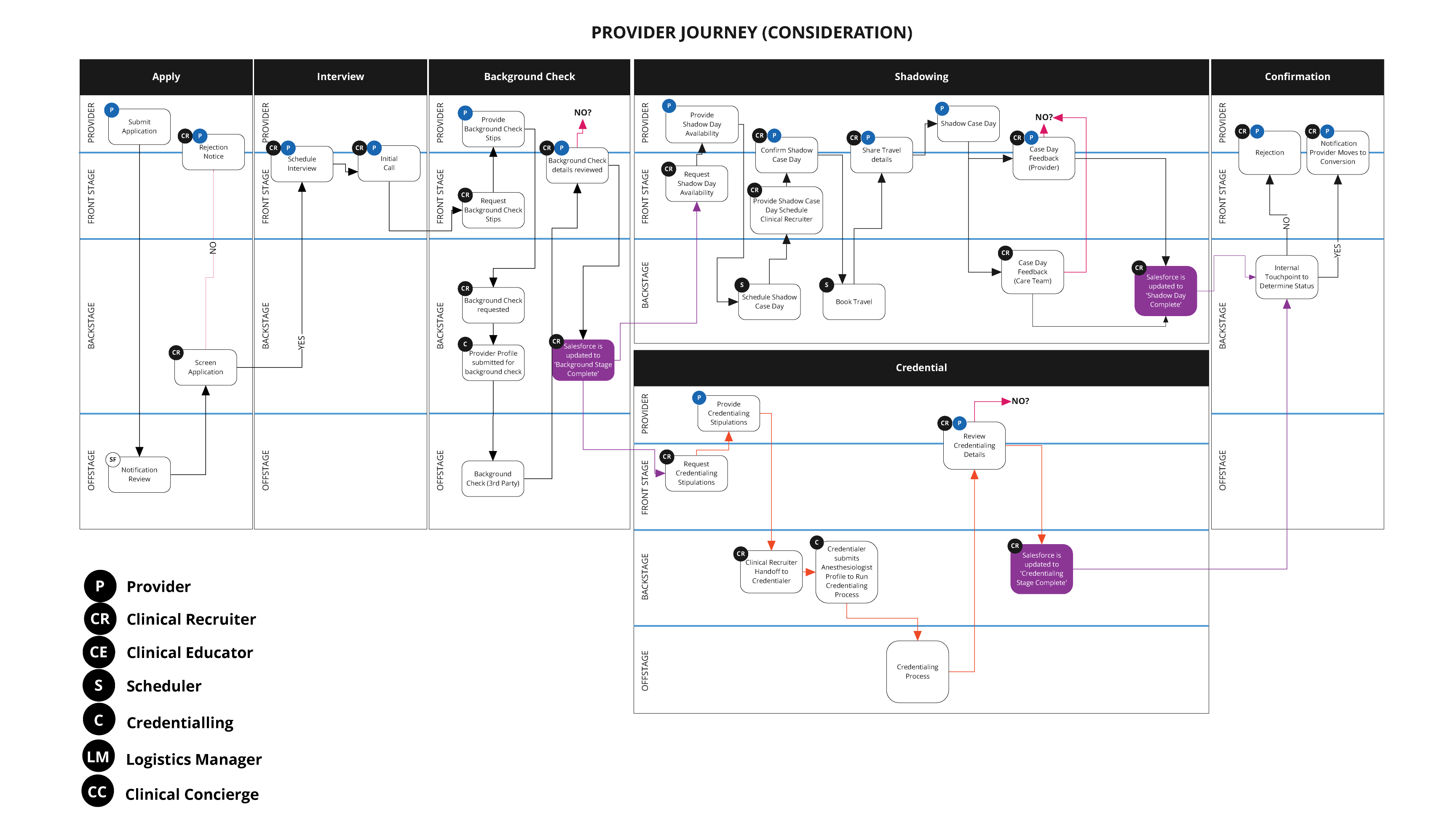
The first stages of design started out as a basic journey map that followed the providers, practices and internal team along the scheduling journey. From there mid-functionality fidelity prototypes (UXPin) were designed to validate internally the minimum input from the practices and providers had been captured. From there a higher functional fidelty prototype was designed to gather feedback on Usefulness from our practices and providers which informed the high-fidelity visual designs.
User Testing
Once the high-fidelity visual designs were added onto the prototype (UXPin), unmoderated Usability studys were launched with users that were like our users (health care providers and health care schedulers) from respondent.io and captured in lookback.io. Those recordings were reviewed, findings noted and adjustments to the designs made.
Outcome
The benefits to the company of the platform's ease of use and adoption:
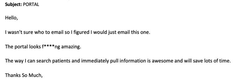
  • Not only was the reception of the platforms by our providers and practices well recieved (see actual customer quote below), the product(s) efficiency gains were double what was projected.
  • The real financial impact was to allow a small scheduling team to scale as operations expanded without needing to add headcount.
  • Resulted in an immediate and substaintial increase in practice and provider satisfaction.
  • Rapid adoption and the resulting transparency of schedule allowed future Service Design efforts to increase profitability for case days.
This was just the beginning, work continued not only on on Provider & Practice facing features but internal applications, Service Design work to begin optimizing each journey and exploring new service offerings.